
Sign up today and see the results for yourself!
Want to speed up your verification process?
Share a screenshot of your ad revenue from the past 3 months.
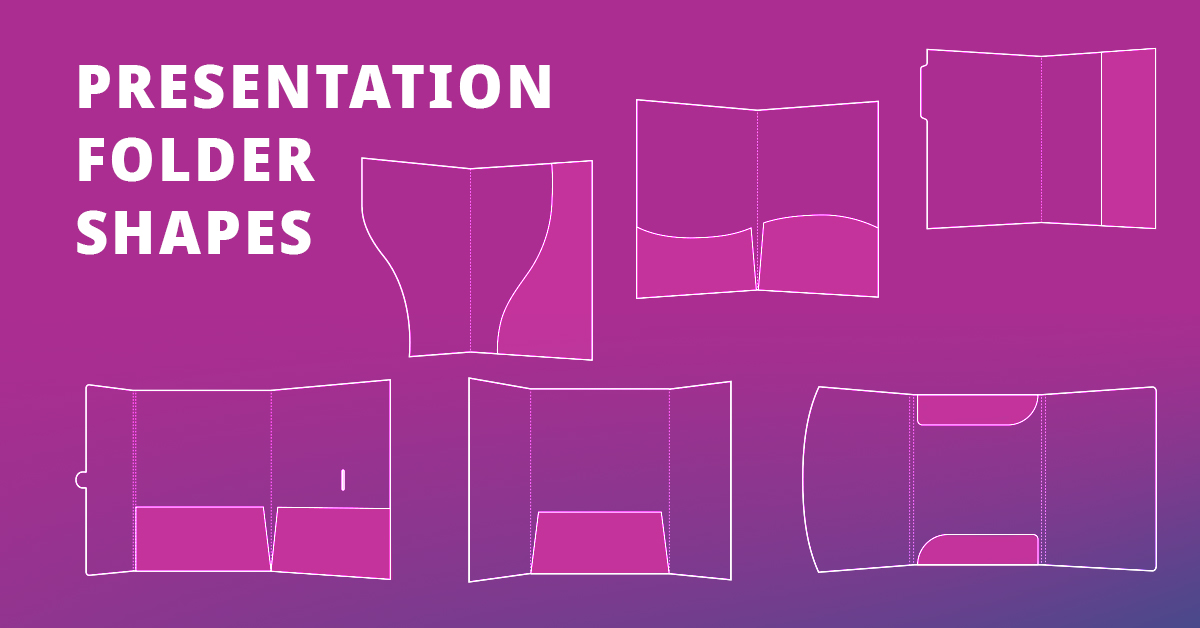
Most printer vendors will tell you they can make a presentation folder. What they won’t tell you is that they’ll hand you two boring layout templates and call it a day. You’ll find the same basic two pocket folder, sold for dirt cheap, at every office supply store.
That’s like telling an artist they can only paint on square canvases. Apparently, they think mediocrity is part of your brand strategy.
Shape is the foundation of design. The fact that almost every printer ignores this should tell you just how low the creative bar in print marketing has fallen. The form, the way a folder opens and tucks, guides the user’s experience just like intelligent UX design does online.
A real folder specialist understands that. They offer hundreds of shapes, pockets, spines, flaps, and closures to fit your vision and strengthen your message. Each detail helps tell your brand story through how it’s built and how it’s held. Form becomes part of the design itself.
We spoke with Vladimir Gendelman of Company Folders, Inc., a presentation folder company trusted by many of the world’s biggest brands. Gendelman explained that “your folder design should be treated as part of your brand strategy. Every curve, tab, and closure is a deliberate choice that aligns with your goals. Whatever that might be will influence the die cut you select. Because when folders are integrated into your overall marketing strategy, or even a single campaign, unique shapes can guide eyes and hands toward your call to action. That’s powerful. It’s exactly where you want your recipient’s attention to land after they’ve absorbed your message.”

A gatefold opens in the center like a pair of doors. It creates drama. Inside, the inner panels open up a versatile canvas for design and messaging, from a welcome greeting to a mission statement. That’s why the gatefold style is a favorite among real estate agencies, hotels, and event planners.
This type opens from the bottom edge, like a sketchbook. The pocket appears first, setting the stage for bold graphics or a tagline. Opened, the top flap can stay blank for a clean look or feature additional artwork.
It feels intuitive and secure. Sheets are held tight at the top and bottom, precisely where they should be, regardless of how you hold the folder.
| Folder Type | Core Advantages | Best For |
| Gatefold | Dramatic “doors-open” reveal; strong first impression; large interior canvas for messaging | Real estate packets, hospitality, events, welcome kits |
| Matchbook | Pocket appears first for a built-in “reveal”; intuitive, secure hold at top/bottom | Handouts that get passed around; short pitches; leave-behinds |
A folder’s reveal is choreography. It decides what your audience sees first and how they feel about it.

A tuck tab is a built-in flap that slips into a slit or slot to keep your folder securely closed. It adds movement and surprise. The flap can wrap around the front or hide a small message inside. This mechanism gives the folder a tactile quality that is both clever and memorable.
A belly band is like gift wrap for your folder. It wraps around the outside and locks in at the back with a tuck tab to keep everything together. You can brand it with your logo, add a tagline or pattern, or include a die cut window that gives a peek at the cover underneath.
When someone removes the band, something is waiting beneath—a hidden message, a discount, or a design detail meant to surprise. It’s pleasant and more personal.
| Folder Type | Core Advantages | Best For |
| Tuck Tab Closure | Adds movement & surprise; prevents contents from slipping; playful interaction | Kits, portfolios, premium presentations |
| Belly Band Closure | Gift-wrap effect; tamper-evident feel; space for logo/tagline/offer | Launch kits, promos, VIP mailers |
Closures like these turn a simple function into a sensory experience. The small act of opening or unwrapping engages the brain’s reward system, making the brand feel more intentional and easier to recall later.

An S-shaped curve gives the layout a sense of motion. It hints at what’s inside and makes people want to open the folder. Most businesses use the exposed panel to showcase their logo, tagline, solid brand color, or website address. It’s a subtle teaser that works well because it plays to curiosity.
Angled cuts guide the eye toward the center, which is a natural focal point for calls to action or key messaging. Our eyes tend to follow diagonal lines, so this subtle direction helps people absorb information in the correct order. The result is a layout that feels natural and easy.
Soft, flowing lines create a friendly and approachable feel. They break up rigid layouts and carry the eye gently across the design. Psychologically, curved shapes evoke warmth and creativity. Folders with wavy pockets help brands communicate a more human and authentic presence. The flowing shape feels less corporate and more personal. This “softening” touch makes materials more inviting to pick up and engage with.
Like the matchbook style, vertical pockets keep materials secure by holding each sheet against the folder’s spine. The tall, narrow format creates a column that’s perfect for printing structured content. Things like product specs, contact details, social handles, or a quick company overview fit great here. Some use the space for a photo, while others leave it blank for a minimalist look or add vertical slits to hold business cards.
Combining horizontal and vertical pockets creates contrast and balance. The perpendicular layout divides content into distinct visual and informational zones. Our brains process vertical and horizontal elements differently, and each direction serves its own purpose. The interplay between them keeps the layout engaging.
| Folder Type | Core Advantages | Best For |
| Serpentine Pocket | S-curve teases contents; sense of motion; encourages opening | Brand reveal moments; minimalist covers |
| Diagonal/Angled Pocket | Guides eye toward center; dynamic layout; easy scan path | Sales sheets with clear CTA; product highlights |
| Curved/Wavy Pocket | Friendly, approachable vibe; softens rigid layouts; creative tone | Education, nonprofits, creative studios |
| Vertical Pocket | Maximum sheet retention; tall column for structured info | Spec sheets, contact blocks, quick overviews |
| Perpendicular Pockets | Combines horizontal + vertical organization; clear zones | Complex kits, mixed collateral sizes |
Pockets are part of how a folder communicates. The way they’re shaped and positioned decides what people notice first and how they move through the contents. Done right, pockets can guide both the hand and the eye.

Adding a third panel gives you six printable surfaces to work with. The layout unfolds in stages—one panel becomes two, then expands into a full three-panel spread. It goes a step beyond the standard two pocket folder, ending with a wide, panoramic reveal that feels complete and satisfying to open.
The best printers offer flexible pocket configurations—single left, right, or center pockets—as well as double and triple pocket setups. The creative possibilities are almost endless. In fact, designing tri-panel folders could be a guide of its own. If I ever write it, I’ll make sure to link it here.
File tabs may be small, but our eyes go to them first. They extend beyond the folder’s edge and often become the most noticeable part of the design. Besides helping people spot the folder quickly, they also make it easier to grab and file away.
Most custom tabs are printed with company names, logos, contact details, or solid colors that contrast with the front cover. Sometimes a mix of all three. Or they can be kept blank for handwritten labels when that’s a better fit for the business.
Die cut windows give presentation folders flexibility and focus. They offer a quick peek at what’s inside, such as a cover sheet, a marketing insert, or an important document. The rest of the folder acts as a frame, drawing the eye toward the cutout.
Businesses love windows because they adapt easily to different uses. A CPA might use them to separate client files or tax returns from various years. A real estate agent might use them to show listings for multiple properties or closing documents. Other companies use them for everything from proposals to receipts to marketing materials.
| Folder Type | Core Advantages | Best For |
| Tri-Panel (Tri-Fold) | Six printable surfaces; staged, panoramic reveal; flexible pocket options | Comprehensive presentations, multi-step stories |
| File Tabs | Fast identification; easy grabbing/filing; high visibility | Filing systems, large sets, internal organization |
| Die-Cut Window | Peek-through focus; frames key content; adaptable to many uses | Proposals, listings, client packets, receipts |
How a folder opens and expands mirrors the way people absorb ideas, one layer at a time. A tri-panel spread feels spacious. A window feels direct. File tabs feel considerate. Get those cues right, and your materials stop competing for attention and start directing it.
The spider chart below illustrates how each presentation folder shape excels in different areas. At a glance, it shows that every style serves a unique communication purpose.

Choosing the right print partner is about more than just comparing prices or turnaround times. Look for someone who offers more than the standard two pocket template. A good presentation folder printer will show you options like gatefolds, tri-panels, custom pockets, closures, and tabs. They’ll explain why one folder layout might suit your goals better than another. See print as problem solving, not just production.
Because in the end, shape isn’t packaging. Shape is design and the printing company you choose determines whether your folder just holds paper or holds attention.

Kean Graham is the CEO and founder of MonetizeMore & a pioneer in the Adtech Industry. He is the resident expert in Ad Optimization, covering areas like Adsense Optimization,GAM Management, and third-party ad network partnerships. Kean believes in the supremacy of direct publisher deals and holistic optimization as keys to effective and consistent ad revenue increases.

10X your ad revenue with our award-winning solutions.